See the video on YouTube at goo.gl/JeV8J


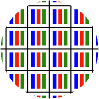
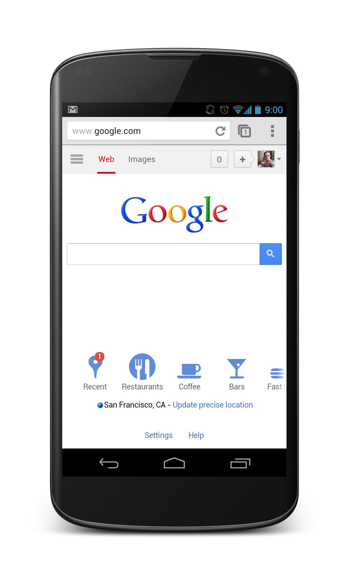
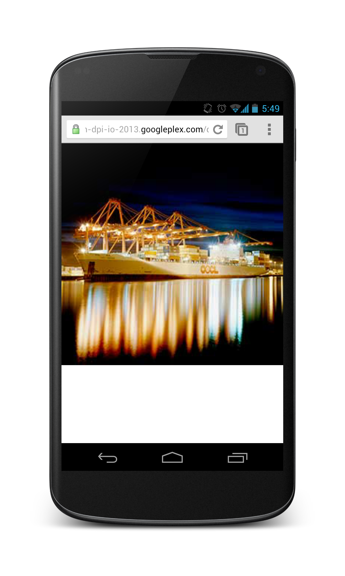
Good
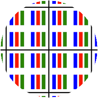
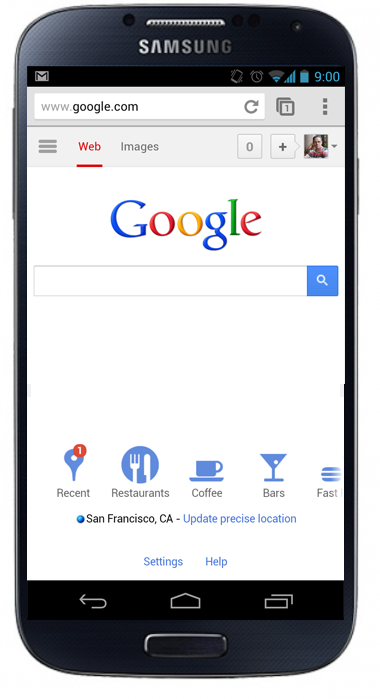
Bad
More pixels, in the same space.

Pixel != Pixel
- Device Pixel
- Represents one physical, hardware pixel
- The smallest unit in a display
- Device-Independent Pixel (DIP)
- An abstract 'pixel' unit
- Typically used when defining UI layout
- Fixed multiple of device pixels (e.g. 1.5x)
- CSS Pixel
(px)- An abstract 'pixel' unit
- Affected by
viewport& zooming - Proportional to CSS
cm,inand evenem
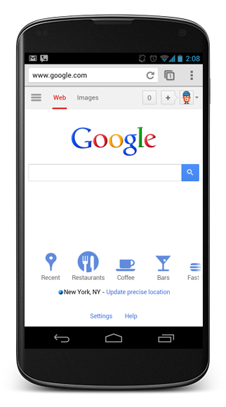
Pixels: a practical example
Nexus 4, 4.7", 768×1280px
- Device pixel ratio
← 2x →
- Device pixels
← 768px →
- Device-independent pixels
← 384px →
- CSS pixels (
px)← varies →
Device pixel ratio and DPI varies
Nexus 7
216dpi
1.3x
Nexus S
235dpi
1.5x
Chromebook Pixel
239dpi
2x
Nexus 4
316dpi
2x
Galaxy S IV
441dpi
3x
Device pixel ratios
The relationship between device pixels & device-independent pixels
-
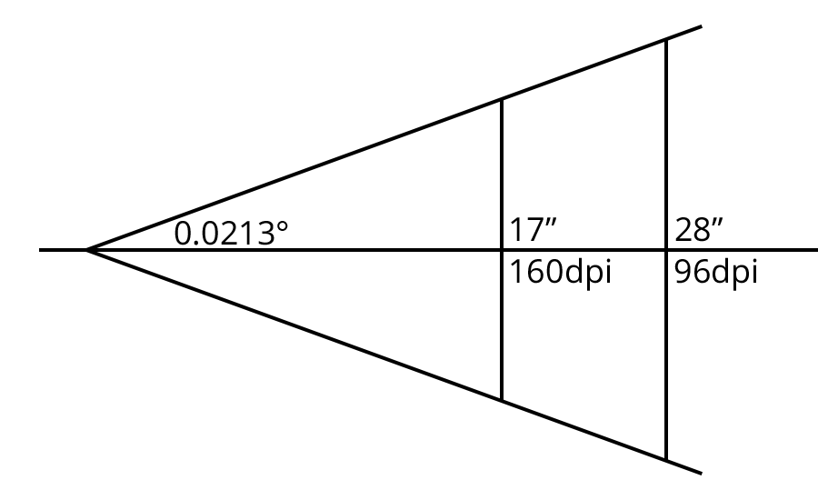
Estimate the distance
How far the user holds the device
17" -
Determine the base (1x) pixel density
Use the CSS reference pixel (96 dpi at 28") as the base
(28 ÷ 17) × 96 ≈ 160 dpi -
Calculate the device pixel ratio
Actual pixel density vs calculated 1x pixel density
316 dpi ÷ 160 dpi ≈ 2x
Often fudged by OEMs to get a round numberwindow.devicePixelRatio
The Practical Stuff
Pixel perfect designs and text
Viewport: width=768?
Nexus 4 is 768×1280 @ 316ppi.
So how about:
<meta name="viewport" content="width=768">
What you want
What you get
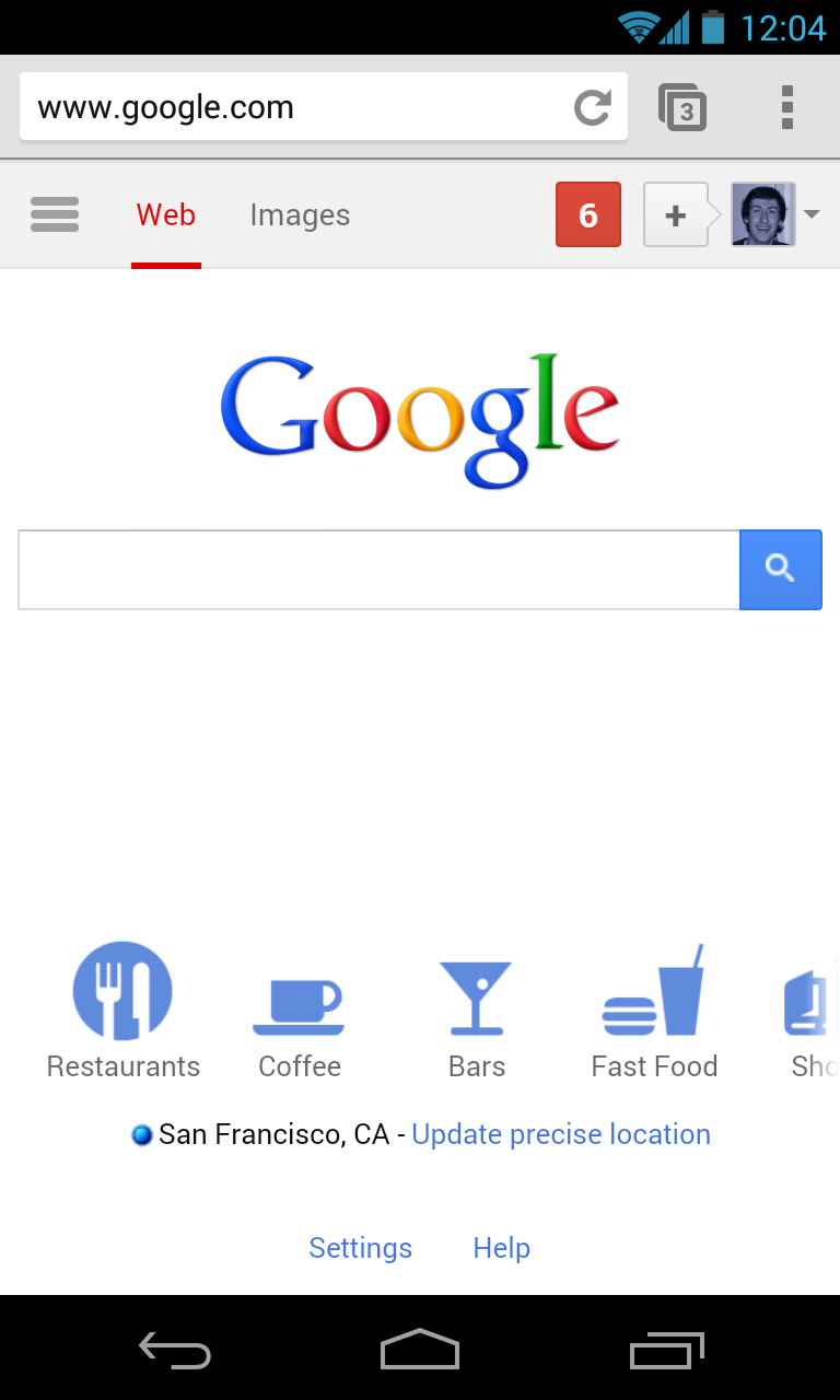
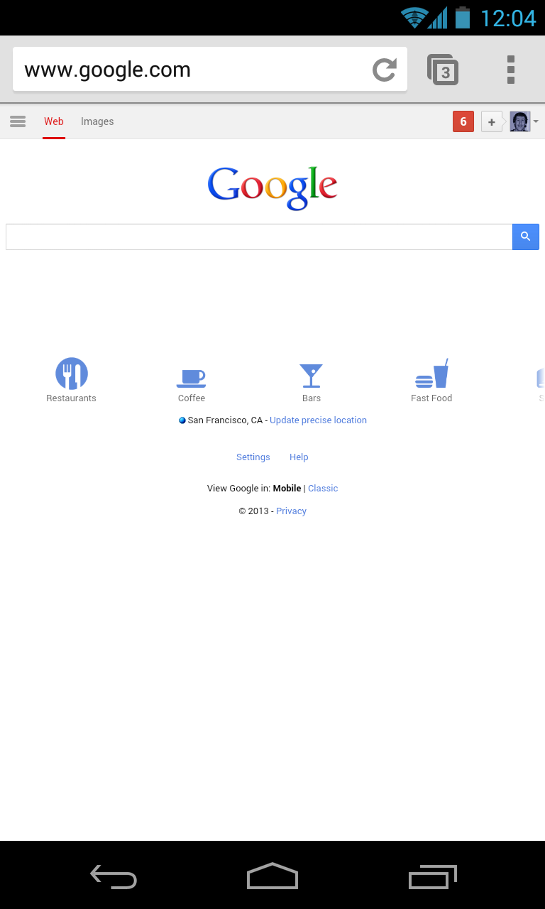
Viewport: width=320?
<meta name="viewport" content="width=320">
Nexus 4 (384 DIP)
Nexus 4 (598 DIP)
Viewport: width=device-width
Allows zoom (recommended):
<meta name="viewport"
 content="width=device-width, initial-scale=1">
Disallows zoom (use sparingly):
<meta name="viewport"
   content="width=device-width, maximum-scale=1">
High DPI-specific markup
Borders, padding, and other CSS properties
Modern browsers are starting to do sub-pixel precise layout.
So does this work?
.thinnest-border { border-width: 1px; }
@media (min-resolution: 2dppx) {
    .thinnest-border { border-width: 0.5px; }
}
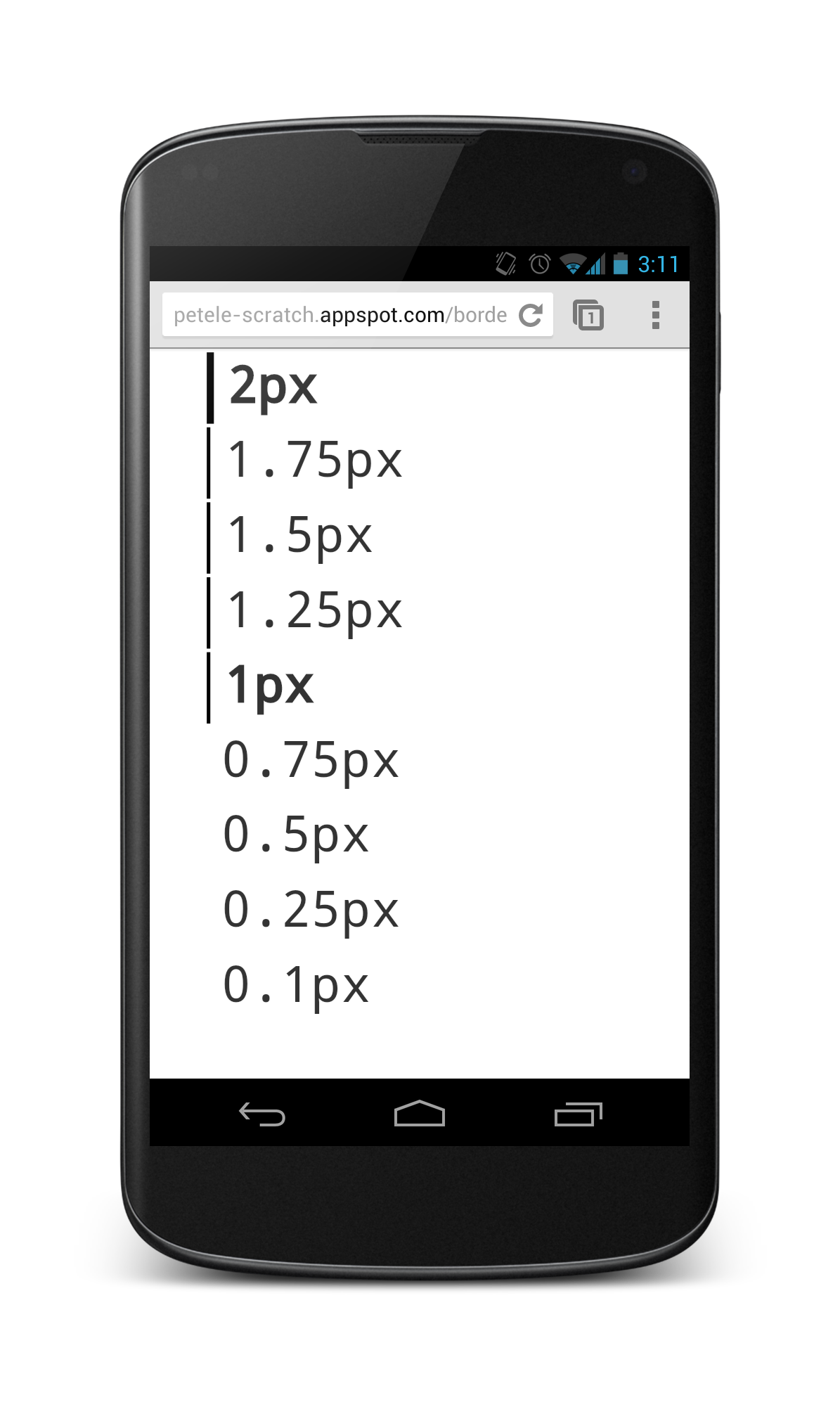 No, stick to 1 CSS pixel as minimum width (or test exhaustively).
Beautiful, legible text
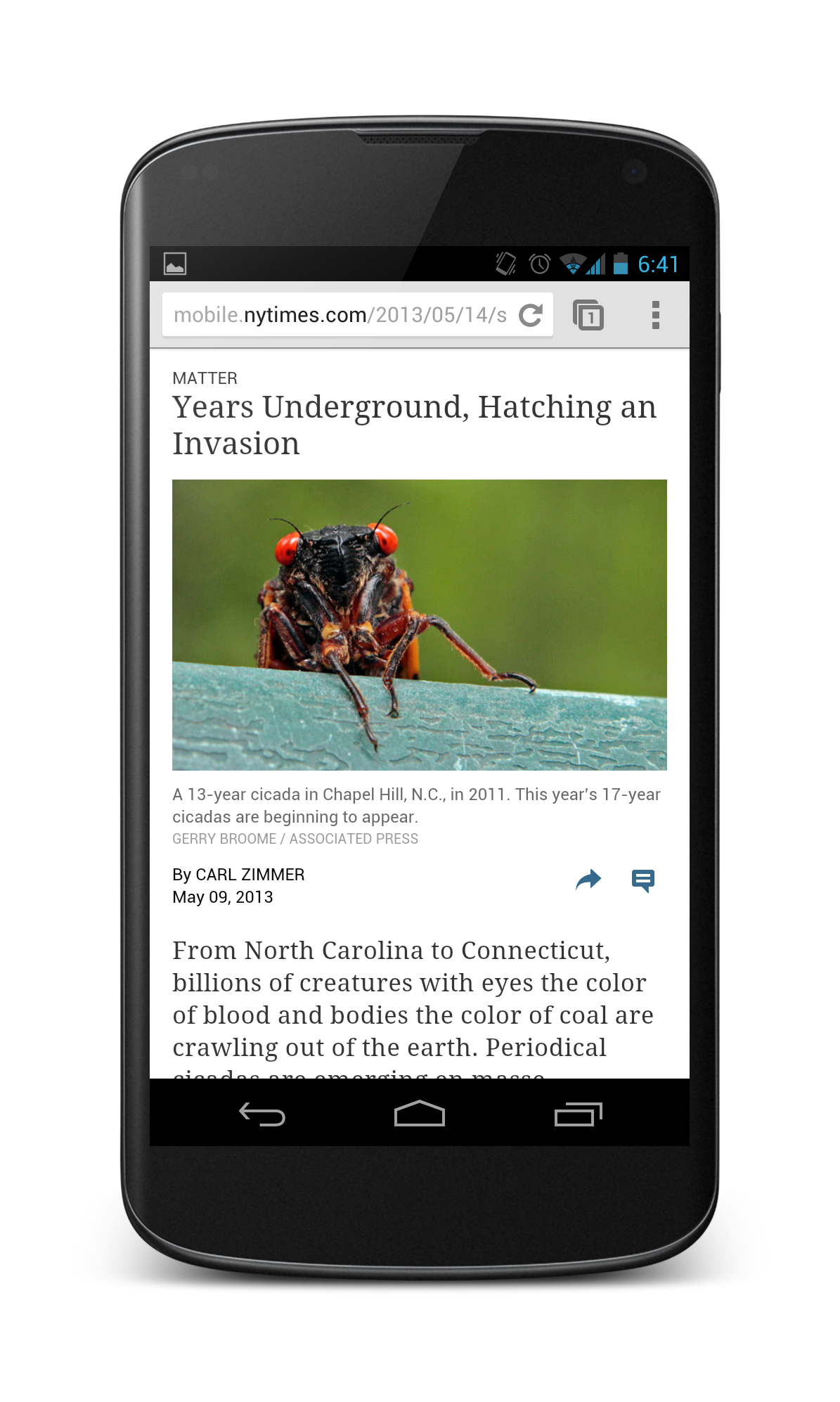
Mobile optimized site
width=device-width
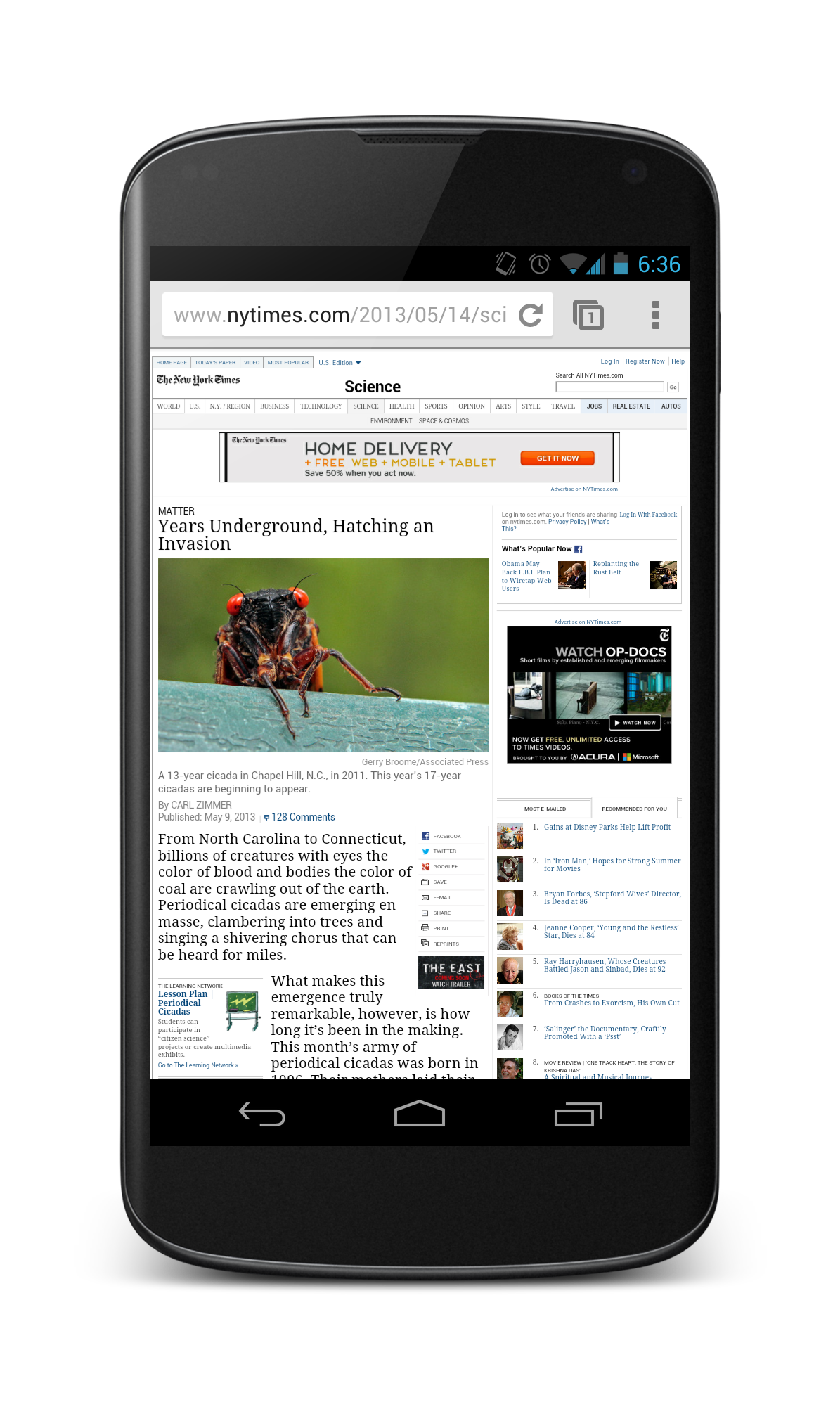
Desktop site
No viewport set
Avoid wide text columns
A phone user has zoomed in on the left-hand side of a wide column of text. The rest of the column is off-screen to the right. The user will have to pan from side-to-side for every line of text they read.
Hashtag tousled DIY shoreditch. Marfa kale chips echo park raw denim. Banksy gastropub lo-fi, tattooed jean shorts ennui pickled deep we farm-to-table gentrify bespoke biodiesel mixtape master cleanse you probably haven't heard of them. Fab plaid bespoke gentrify put a bird on it wes anderson, 3 wolf moon vinyl salute actually tofu messenger bag keffiyeh. Bespoke fingerstache bushwick, odd future pitchfork echo park banh mi pork belly. Etsy put a bird on it vegan keytar, high life organic fingerstache bespoke art party mumblecore. Church-key lomo 90's, before they sold out odd future master cleanse vegan locavore.
Text autosizing
aka. font inflation, font boosting, or text size adjustment
Desktop (Chrome)
Nexus 4 (Chrome)
24px
32px
15px
26px
13px
13px
How to avoid text autosizing
- Use a Responsive Web Design, or dedicated mobile site
(width=device-width) - Use only narrow columns
(<= device-width, or <= 320px to be safe)
Last Resort, opt out of autosizing:
.dont-autosize {
  -webkit-text-size-adjust: 100%; /* Mobile Safari */
  -moz-text-size-adjust: none; /* Firefox for Android */
  -ms-text-size-adjust: none; /* IE Mobile */
}
.dont-autosize, .dont-autosize * {
  max-height: 1000000px; /* Chrome for Android */
}
The Practical Stuff
Graphics and images
Raster vs. Vector

Raster image scaled to 4x

Vector image scaled to 4x
Alternatives to raster images
 Fonts
Fonts
Üñíçø∂ê Characters
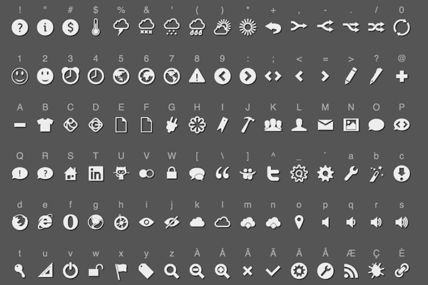
Icon Fonts
Background images with CSS
.logo {
  width: 100px; height: 100px;
  background: url(low.png);
}
@media
only screen and (-webkit-min-device-pixel-ratio: 1.5),
only screen and (-o-min-device-pixel-ratio: 3/2),
only screen and (min-resolution: 144dpi),
only screen and (min-resolution: 1.5dppx) {
  .logo {
    background: url(high.png);
    background-size: 100px 100px;
  }
}
Highly compressed 2x images
Highly compressed 2x images look better and
are smaller in file size.

1X JPEG @ quality 90
File size: 62.69KB

2X JPEG @ quality 30
File size: 39.36KB


1X JPEG @ quality 90
File size: 62.69KB
File size: 62.69KB
2X JPEG @ quality 30
File size: 39.36KB
File size: 39.36KB
WebP
A new image format for the web
- Use a service like PageSpeed to make deployment easier.
2X JPEG @ Q80
File size: 145.31KB

2X WebP @ Q80
File size: 38.38KB
High DPI images in CSS: image-set
- Experimental! CSS Image Values and Replaced Content Module Level 4
- Vendor prefixed in Chrome and Safari
.logo {
  background-image: url(fallback.png);
  background-image: -webkit-image-set(
    url(low.png) 1x, url(medium.png) 1.5x, url(high.png) 2x);
  background-image: image-set(
    url(low.png) 1x, url(medium.png) 1.5x, url(high.png) 2x);
}
High DPI images in HTML: img srcset
- Upcoming standard, not yet implemented anywhere.
<img alt="my awesome image" src="banner.jpg"
  srcset="banner2x.jpg 2x, banner-phone.jpg 640w, banner-phone2x.jpg 640w 2x">
- banner.jpg rendered as default image
- Renders banner2x.jpg on 2x display
- Renders banner-phone.jpg on devices with a viewport < 640px
- Renders banner-phone2x.jpg on devices with a viewport < 640px with a 2x display
What about adaptive images?
Images that are full width or percentage width

Today
- JavaScript image replacement
- Lots of complex
@mediaqueries - User-agent sniffing
- Cookie with the screen width & height
- Set the
<base href=…and use URL rewriting
Under discussion
- Image
srcsetand/or<picture>element - Client Hints header
- Progressive image format + smarter browsers
High DPI canvas
And the canvas backing store
canvas
300px
canvas backing store
300px × 2 (device pixel ratio) = 600px
Scaling the canvas element
var ctx = canvas.getContext('2d');
var ratio = window.devicePixelRatio

if (ratio > 1) {
  canvas.style.width = canvas.width + "px";
  canvas.style.height = canvas.height + "px";
  canvas.width = canvas.width * ratio;
  canvas.height = canvas.height * ratio;

  // Now scale the context to undo our changes to the canvas coordinate system.
  ctx.scale(ratio, ratio);
}
/ (ctx.webkitBackingStorePixelRatio || 1);
webkitBackingStorePixelRatio will always return 1 except on desktop Safari on a Retina MacBook, which returns 2. For now.
Beautiful favicons
- ICO file (multi-resolution file): 16×16px and 32×32px
- PNG file: 32×32px
<link rel="shortcut icon" href="path/to/favicon.ico">
<link rel="icon" href="path/to/favicon.png">
Towards a crisp, sharp web
- Setting
width=device-widthmeans you only have to care about device independent pixels - If you don't set the viewport to
width=device-width, or if you use a fixed width, you're in a world of hurt. - The devicePixelRatio on high DPI devices can range from 1.3 to 3
- Use vector images wherever possible
- Use
@mediaqueries to specify appropriate background images - Highly compressed 2x images work well in many cases
- For sharp
canvasimages, beware ofwebkitBackingStorePixelRatio - Go build beautiful!
<Thank You!>
Video: http://goo.gl/JeV8J
Slides: http://goo.gl/j5Z5W